
Banners are a great way to show what is a header without learning a fancy font and they work with those too. In this short post, I’ll go through the simplest way to create a banner for a header in your sketchnotes and then share a few variations you can try.
Step one: write the header
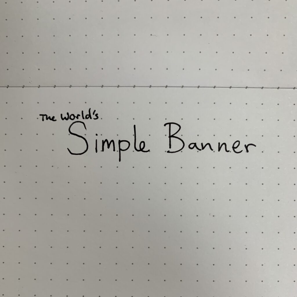
You could make the banner first, but for beginners it’s far better to start with the text. It takes time to develop an instinctive knowledge of how much space text will take up and even then, things can go wrong.
By writing the heading first, you know how much space your banner will need to take up.
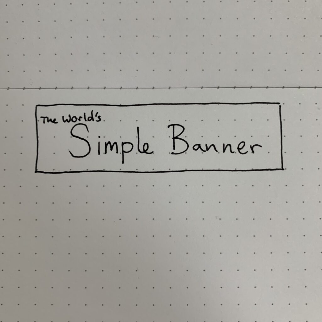
Step two: draw a rectangle around the text
In theory, you could stop at this step. That really would be the simplest banner! But we’re going to add a couple more steps to create something a bit more interesting.
Step three: Draw some offset parallel Lines
If you have a dot grid notebook or paper, you can offset your banner exactly. In a plain notebook, you’ll need to go with your eye. Try to keep them the same height and more or less even.
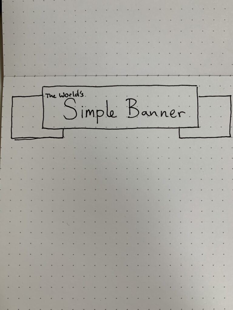
Step four: connect the lines diagonally
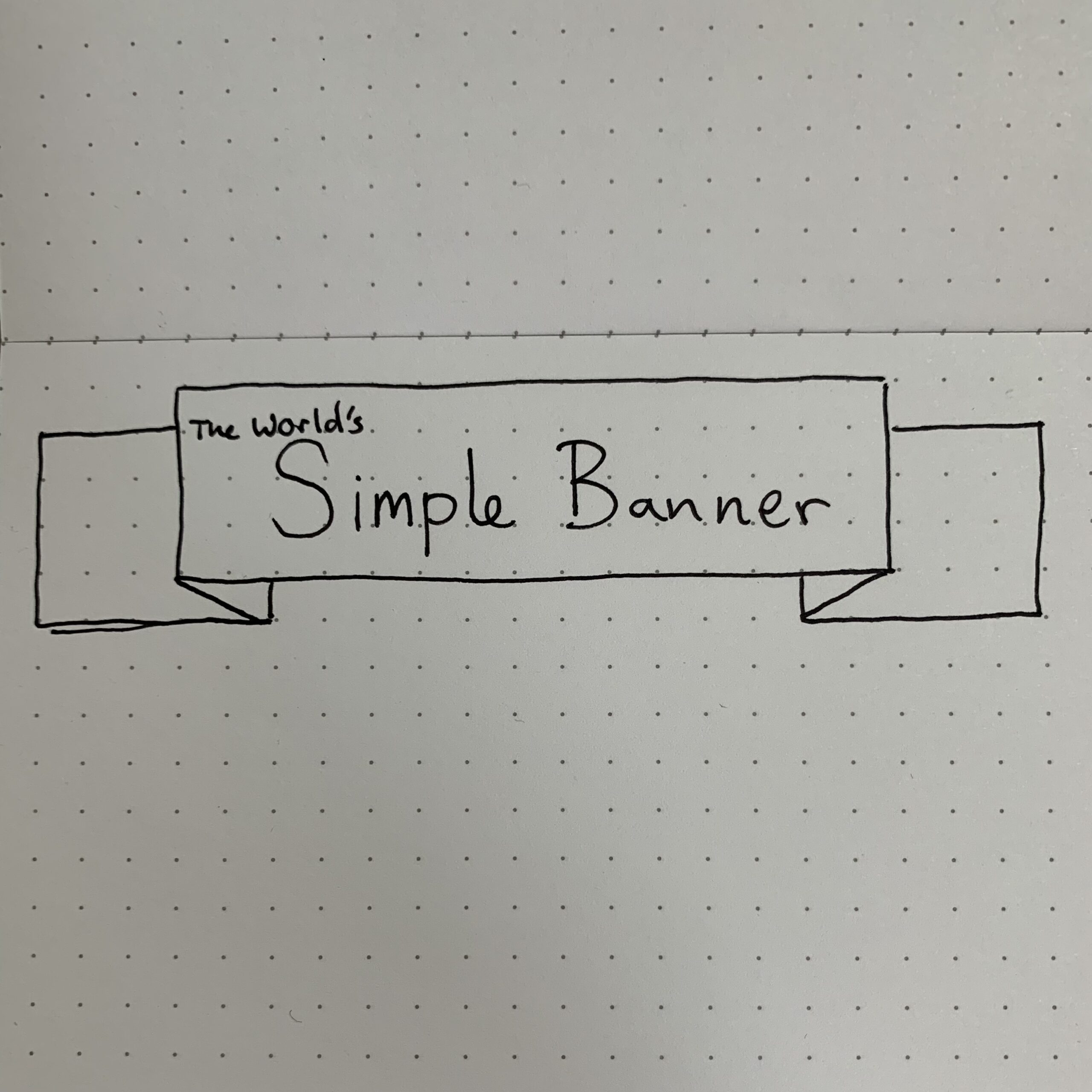
Now, add diagonal lines from the front part of the banner to the background elements. This should form small triangles which are the fold in the banner.
With this step, you’re basically done.
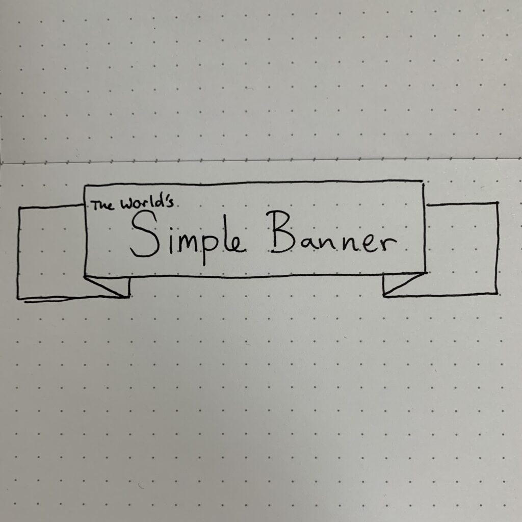
Step five: finish it off!
At this point, all you need to do is close of your banner and add any final touches you want. This can include filling in the “folded” section to add some depth, or adding some shadow below the banner to make it appear like it is floating.
If you are a using a digital tool, it’s easy to add multiple shades of colour with the front of the banner the lightest, the back layer slightly darker and the fold the darkest.
More simple sketchnote headers and upgrades
While this is a very simple way to create banners for sketchnotes, there are some alternatives and small upgrades that can enhance your headlines.
1. The wavey banner
Instead of a straight rectangle, create a wavey banner that looks like it is blowing in the wind.
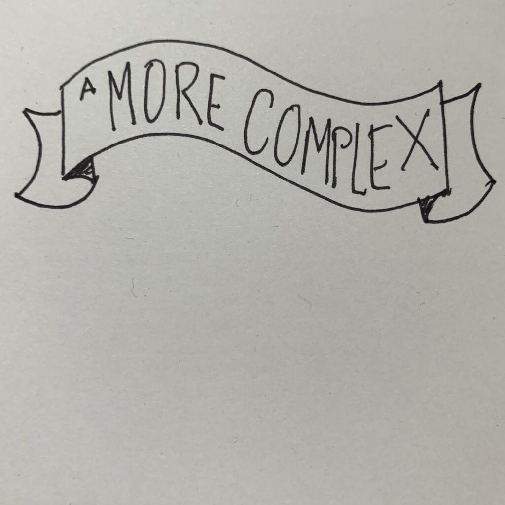
A couple of points to note:
- Make sure the waves are in parallel
- If you can, make the text warp to the banner coming closer or further away.
2. The sign
This headline uses a rectangle as well, but instead of making it look like a ribbon, we add posts to make it look like a sign. For smaller text, you can add one pillar, or you can use multiple for larger one.
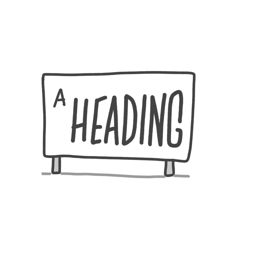
You might want to change the signs shape to match the message such as pointing in a direction.
3. The cork board
This time, we’re putting paper on a cork board. Start with an outline that represents a piece of paper with the information. This “paper” can be flat and even, or it can bend and flex as it comes of the board — it’s your choice.
Next, add pins to each corner (and optionally, the middle) of the paper before finally adding the cork board behind the “paper”.
Time to apply!
There are hundreds more styles of banners, some subtle variations and some more complicated styles. The most important thing to do is to practice them. Once you’ve nailed these, see if you can emulate the styles of other sketchnoter, or create your own stock sketchnote header template.
Leave a Reply